

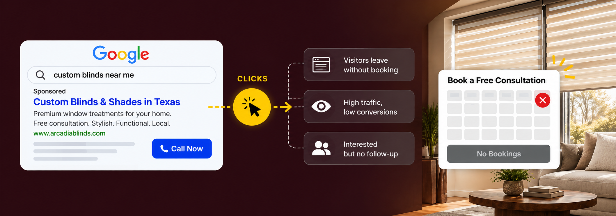
The photos may look polished. The logo may feel premium. The homepage may have smooth animation, elegant typography, and a gallery full of finished rooms. Yet homeowners can still leave without calling, requesting a measure, or booking an in home consultation because the site makes them work too hard to answer basic buying questions.
That is the real job of blinds website design. The website has to help a local homeowner move from interest to confidence, then from confidence to a useful next step. It should make the right product easy to find, show enough proof to reduce risk, explain how the consultation works, and make it simple to contact the company from a phone.
For a blinds and shutters business, design is not separate from marketing. It sits in the middle of the funnel. SEO, Google Ads, Google Business Profile, referrals, social media, and email can all send people to the site, but the website decides whether that attention becomes a serious sales conversation.
A Good Looking Website Can Still Leak Ready Buyers
Most owners know when a website looks dated. The harder problem is recognizing when a modern website is still creating conversion friction.
A visitor might land on a homepage that says Transform Your Space With Beautiful Window Treatments. That sounds pleasant, but it does not immediately answer whether the company installs plantation shutters, motorized shades, custom blinds, drapery, or all of them. It may not say where the company works, whether consultations happen in the home, whether measurement is included, or how quickly the homeowner can speak with someone.
The owner sees branding. The customer sees unanswered questions. The strongest window treatment websites reduce uncertainty quickly, telling the visitor what the company sells, who it serves, where it works, what makes the experience different, and what the next step looks like. The visual design should support those answers rather than compete with them.
Orient a new visitor immediately
Within the first part of the page, a homeowner should be able to answer all five.
What does the company provide?
What is the main service area?
What type of customer does it serve?
Why is the business credible?
What action to take next?
A Dallas Fort Worth blinds company, for example, could make the opening much clearer by saying that it designs, measures, and installs custom blinds, shades, shutters, and motorized window treatments across its actual service area. The supporting proof, reviews, years in business, manufacturer relationships, installation photography, should appear early, removing doubts in the order a buyer feels them.
Window Treatment Buyers Need Clear Product Paths
Window treatments are visual, but they are also a category problem. Many homeowners arrive with only a partial understanding of what they need. One person knows they want plantation shutters. Another knows they need privacy but is unsure whether cellular shades, roller shades, or blinds are the best fit. A commercial buyer may be thinking about glare, durability, maintenance, safety, and multi room installation rather than interior style.
The website should make these paths obvious. A useful main navigation can separate major product families such as Blinds, Shades, Shutters, Drapery, Motorized Window Treatments, and Commercial Window Treatments. Each important commercial category should lead to a page that helps the visitor understand that product rather than one generic page containing a few sentences about everything.
This is where website structure and Window Treatment SEO work together without becoming the same task. SEO helps Google identify the right destination for a search. Website design helps the person who reaches that destination understand the product and feel confident enough to continue.
Design for Two Different Buying Speeds
A window treatment website usually serves at least two types of visitor. The first is exploring, comparing shutters with blinds, looking at motorized shade ideas, or estimating what a whole home project could involve. This person needs education, inspiration, photography, product comparisons, and clear links to the next useful page.
The ready buyer behaves differently. They may already know what they want and simply need to know whether the company serves their ZIP code, whether the work looks good, and how to schedule a consultation. A good site supports both speeds, providing enough depth for research while keeping a strong consultation action visible throughout the journey. The mistake is forcing every visitor into a form before they understand the product, or hiding the form until the visitor reaches the contact page.
Product Pages Should Prepare the Sale Before the Consultant Arrives
A strong product page does more than rank for a keyword. It improves the quality of the sales conversation. A homeowner who understands the basics before the appointment can spend more of the consultation discussing the actual room, style, budget, and project scope.
Plantation shutters
Where shutters work well, visual and practical benefits, material choices, light control, privacy, maintenance, measurement, and installation.
Motorized shades
Power options, remote control, wall controls, smart home compatibility, shade styles, large window applications, and installation planning.
Every product page
Real projects, common questions answered, and a clear next step, not the same generic copy reused everywhere.
Mobile Is Not a Smaller Desktop Version
Many homeowners will discover a window treatment company on a phone, especially through Google Maps, paid search, social media, or a referral link. The phone number should be easy to tap. The main consultation action should be obvious without repeated scrolling. Product galleries should load quickly and be easy to swipe. Forms should work smoothly with mobile keyboards and autofill.
Google uses the mobile version of a site for indexing and ranking, which makes mobile completeness important for search as well as conversion. Test the website using the situations customers actually face: open it on a phone in bright light, try to find plantation shutters, try to call the company, try to complete the form using one hand. Small friction becomes obvious very quickly.
Real photography, not stock decoration
Window treatments are one of the most visual local service categories, which makes real photography unusually valuable. A homeowner wants to see how shutters look across a full room, how roller shades sit inside a finished window, and whether installation quality matches the price position of the company. Stock photos can support the visual system, but they should not replace evidence of real work.
Show wide room views, clean installation details, difficult windows, large openings, and before and after examples. The Arcadia Blinds Case Study shows the broader principle: strong visual design creates more value when it is connected to real proof and a clear next step.
Trust Matters More When You Are Asking to Enter Someone's Home
An in home consultation requires more trust than a simple ecommerce purchase. The homeowner may be inviting a consultant into a private space, discussing budget, measuring bedrooms, or making a decision that affects several rooms. Clear company information, professional team photography, genuine customer reviews, service area clarity, and a simple explanation of what happens during the appointment can all reduce uncertainty.
Branding and Lead Quality are connected here. A site that looks generic, inconsistent, or unfinished can make an otherwise capable business feel risky. A more polished identity will not rescue a weak sales process, but it can strengthen the confidence created by reviews, projects, and clear communication.
Avoid trust theater. Do not fill the page with vague badges, invented claims, or meaningless statements such as Number One Choice unless the claim can be supported. Specific proof is stronger. A real review about measurement, communication, product knowledge, and installation tells a buyer more than a decorative trust icon.
Enough momentum, enough context
A practical first form asks for these fields, matched to the real sales process.
Name, phone, email, ZIP code
Product interest
Approximate windows or rooms
Project timing and preferred contact
If a question does not change how the team responds, consider whether it belongs on the first step. The confirmation experience matters too: confirm the request was received, explain what happens next, state the expected contact process, and give the homeowner a way to call if the project is urgent. Not every serious buyer wants to fill out a form, so make the phone number visible in the header, accessible on mobile, and appropriate near high intent sections, and track calls where practical.
Website Speed Is a Conversion Issue Before It Is an SEO Score
Window treatment sites can become slow because the category depends heavily on photography, galleries, video, animation, and product imagery. The answer is not to remove everything visual. It is to compress large images while protecting useful detail, serve images at sensible dimensions, and avoid loading an entire project gallery before the visitor reaches it.
Google's current Core Web Vitals guidance focuses on loading performance, responsiveness, and visual stability, with recommended good thresholds of Largest Contentful Paint within 2.5 seconds, Interaction to Next Paint under 200 milliseconds, and Cumulative Layout Shift under 0.1. A perfect score is not the business goal. The goal is a site that feels fast and stable, especially since every paid click that lands on a slow page is an expensive opportunity to lose attention.
Your Website Has to Support Google Ads Without Becoming One Giant Landing Page
The main website and dedicated campaign landing pages serve different jobs. Someone clicking an ad for plantation shutters should land on a page that clearly continues the shutter conversation, not search through the site to confirm it is offered. Google recommends close alignment between ads, keywords, landing pages, and calls to action, a principle that reduces buyer confusion well beyond Quality Score.
The Window Treatment PPC strategy should decide which commercial searches deserve paid budget and which campaigns need dedicated experiences. Website design should make sure those experiences feel credible, consistent, and easy to convert on, through a flexible page system rather than a full redesign every time a campaign changes.
Local Service Area Clarity Removes Another Reason to Leave
A homeowner should not need to search the footer to determine whether the company serves their city. State the primary service area clearly on the homepage and relevant contact or consultation sections. If the company serves a large metro, explain the main markets it genuinely covers without listing every suburb in every paragraph.
Local SEO vs Paid Ads is ultimately a channel question, but both channels depend on the website telling a consistent story about services, geography, proof, and the consultation process.
A submission is not the finish line
If a homeowner submits a request at 7:30 in the evening and hears nothing until the next afternoon, the website technically converted while the business may still lose the opportunity. The confirmation page, automated acknowledgment, lead routing, call process, appointment scheduling, and follow up all influence the value of the original conversion.
AI Lead Management for Contractors can support immediate acknowledgment, missed call recovery, routing, reminders, and structured follow up while the human salesperson handles the actual design conversation. This matters because the sale continues through several stages: booked consultation, completed measure, quote, sold project.
Measure the Website Like a Sales Funnel
Traffic is useful context, but it is not enough to judge whether the website is improving the business. At minimum, track the pages that attract qualified traffic, calls, consultation forms, product interests, booked consultations, and the source of those inquiries. When CRM data is available, continue the chain through completed consultation, quote, sale, installed revenue, and gross profit.
Consider a hypothetical example. Page A receives 1,800 monthly visits and creates 35 consultation requests, with 12 completed consultations and four sold projects. Page B receives only 600 visits and creates 24 consultation requests, 18 completed consultations, and nine sold projects. Looking only at traffic would favor Page A. Looking at sold work tells a very different story. Website design should be reviewed against business outcomes, not screenshots, bounce rates, or aesthetic preference.
Thirty one questions for the site you have today
Structure & proof
10 itemsMobile, forms & speed
10 itemsFrequently Asked Questions
What should a blinds and shutters website include? +
Should a window treatment company show pricing on its website? +
Should every product have its own page? +
Do blinds companies need separate landing pages for Google Ads? +
How important is mobile design for a blinds company? +
Does a new website automatically improve SEO? +
Your Website Should Make the Next Sale Easier
The best blinds website is not necessarily the one with the most animation, the largest gallery, or the trendiest layout. It is the one that helps the right homeowner understand the product, trust the company, and move into a qualified sales conversation with as little unnecessary friction as possible.
Start with the products you actually want to sell. Give those products clear pages. Show real work. Explain what happens during the consultation. Make the site comfortable on a phone. Keep the visual experience fast. Connect SEO and paid traffic to the right destinations. Track what happens after the form. Then judge the website by consultations, sold work, and revenue rather than appearance alone.
Yay Blitz helps blinds, shutters, and other local service businesses connect Graphic and Web Design, branding, paid traffic, local SEO, lead tracking, and follow up into one measurable customer acquisition system. If your window treatment website looks good but is not producing enough qualified consultations, start with a free strategy assessment .
 Funnel Strategy
 Graphic & Web Design
 Paid Local Ad
 Marketing Strategy